Underpainting in Watercolor
- Lindsey Chester

- Jun 30, 2025
- 2 min read

While I have a BFA in Fine Art, I never formally studied painting. I majored in printmaking. I sidestepped painting in college because it didn't seem "practical". It was the 1980's and much of our course load was very theoretical and abstract. I focused on graphic design, photography and printmaking, in my belief I would learn some job skills.
That led me to research and learn on my own when I began painting in my late 50's in watercolor and acrylics. I've had to teach myself color mixing, how to set up a palette, learn about the qualities of paint, canvas and paper, brushes etc.
I've picked up all sorts of techniques from YouTube videos and I network with other artists.
One of the best techniques I learned recently was underpainting in watercolor.
I recently took a cool workshop offered by Strathmore online. I highly recommend these FREE classes taught by amazing practicing artists. You can watch them over and over, work along with them, and repeat!
The four part series on Underpainting was GREAT!
What is Underpainting?
I had heard about underpainting, and had tried it with acrylic painting with limited success.
However, when underpainting is applied to watercolor- the results are truly AMAZING!
Essentially, underpainting is applying a one-color underlying layer of paint that establishes the tones, or values, of your painting. This unifies the composition and sets you up for all the subsequent color values in the finished work.
The underpainting can also influence the overall color tint of the entire painting.
Looking for a cool-toned image? Use Paynes Grey to underpaint. Want your image to have a warm feeling? Try burnt sienna.
How to Underpaint?
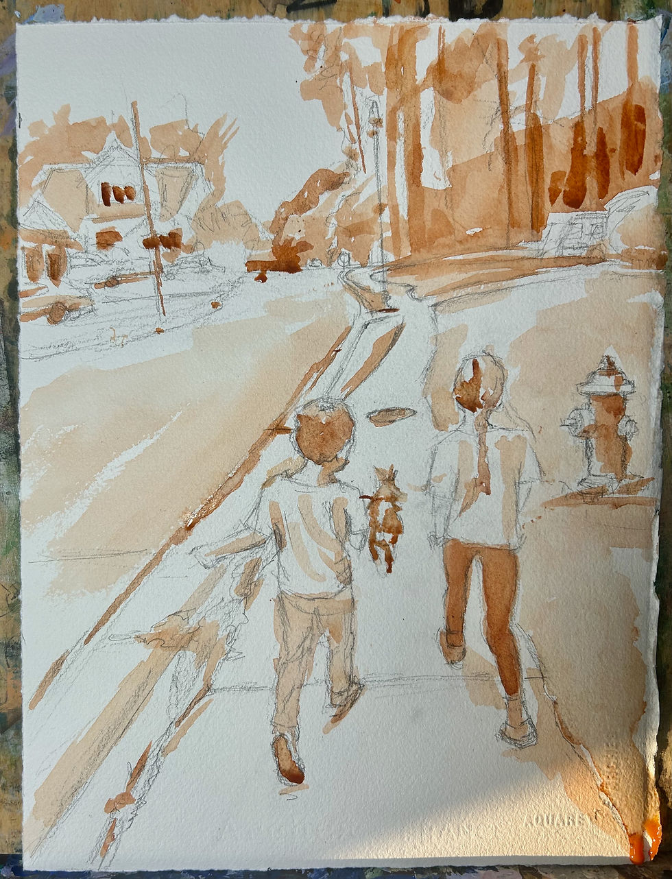
First draw your image on your paper. I believe in sketching accurately as this establishes the correct perspectives and shapes.
Decide what color you want to use for the underpainting.
Suggested pigments:
Burnt sienna, payne's grey, alizarin crimson, ultramarine blue, yellow ochre.
Or try your own and see what happens.
As you can see above, I left the white paper showing in the lightest areas of the composition, and then filled in medium and light tones accordingly.
Let this COMPLETELY dry before applying color.
Once its dry , I start with my lightest layers first and apply local color (that means the color that should go in an area, such as the green in the trees, or brown in the hair.
See the following images for this painting's progression:

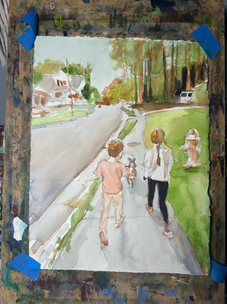


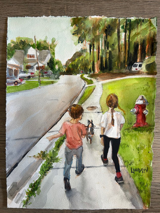

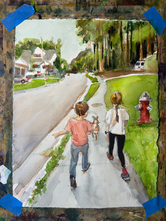
Underpainting gave this image an underpinning to hold everything together. It also added depth easily to the darkest parts of the composition.
Let me know your thoughts in the comments.


Comments